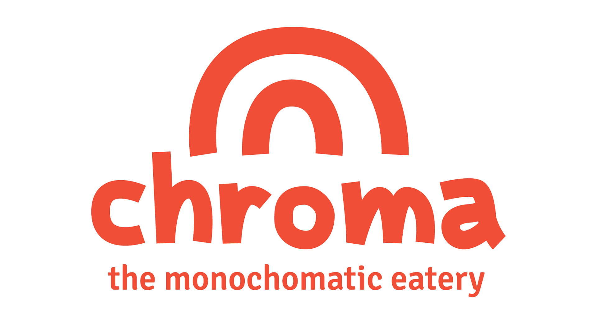
chroma is a restaurant brand created from my own concept. It is a New American eatery serving monochromatic dishes.
Positive messaging, bright colors, and quirky patterns are used throughout the brand's collateral because chroma was designed for the young creative with a positive outlook on life.
Adobe Illustrator and Figma. 2020.
The Challenge
Create a unique restaurant concept, its accompanying brand collateral, and a simple website.
Defining the Brand
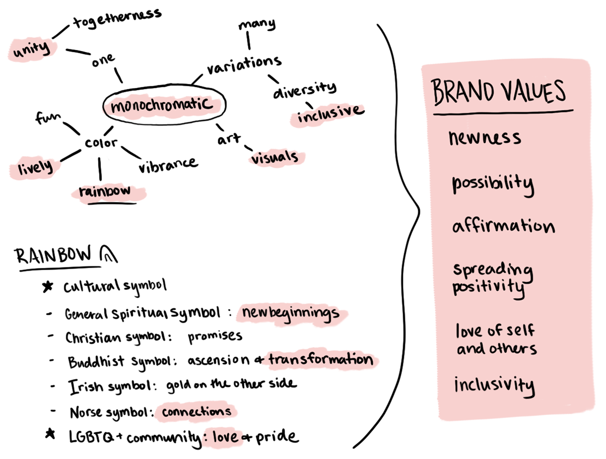
Because a main element in this restaurant is the use of color, I took inspiration from the symbolism of a rainbow to dictate chroma's values and feel.
Logo Ideation
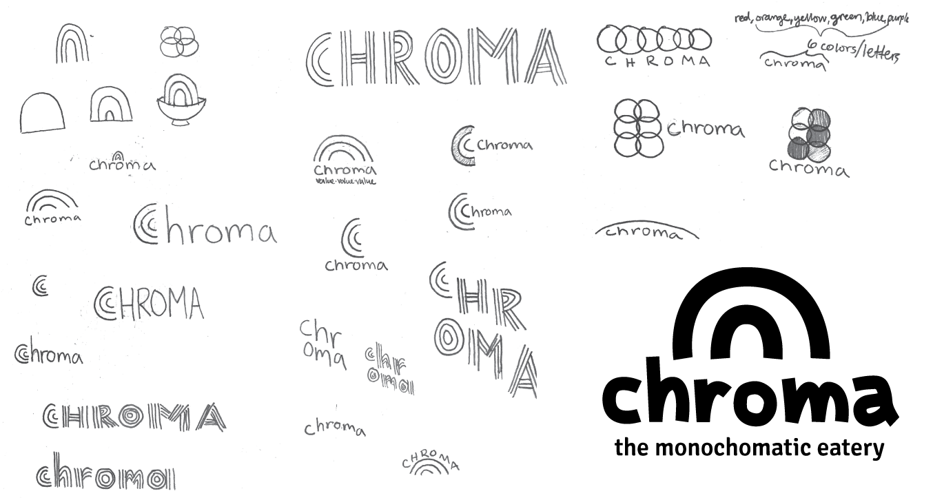
The domed shape of a rainbow inspired my logo ideation process. I decided to hand-make the letters of "chroma" to give the logo an organic and lighthearted feel.
Brand Book
Brings together the brand values, style choices, guidelines, and example collateral.
Business Card
Designed to model the organic, lighthearted feel of the handmade rainbow logo.

Magazine Advertisement
The bright colors of the bowls draw the viewer in and communicate the nature of this restaurant being focused on color.
The text surrounding the image addresses the viewer to sustain attention and communicates three chroma values: affirmation, inclusivity, and spreading positivity.
Smaller text explains what chroma is and where the restaurant is located.

Menu
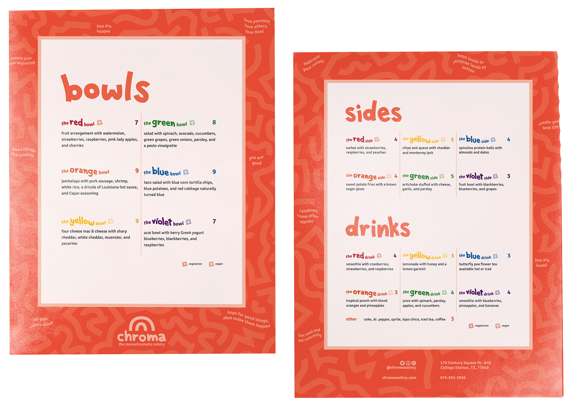
Since every chroma-made menu item is named after the monochromatic color scheme it falls under, I decided to color the menu item names with the color it is.
There are icons to designate vegan/vegetarian items and positive idioms lining the border such as, "embrace your colors" and "love, yourself, love others, love food".
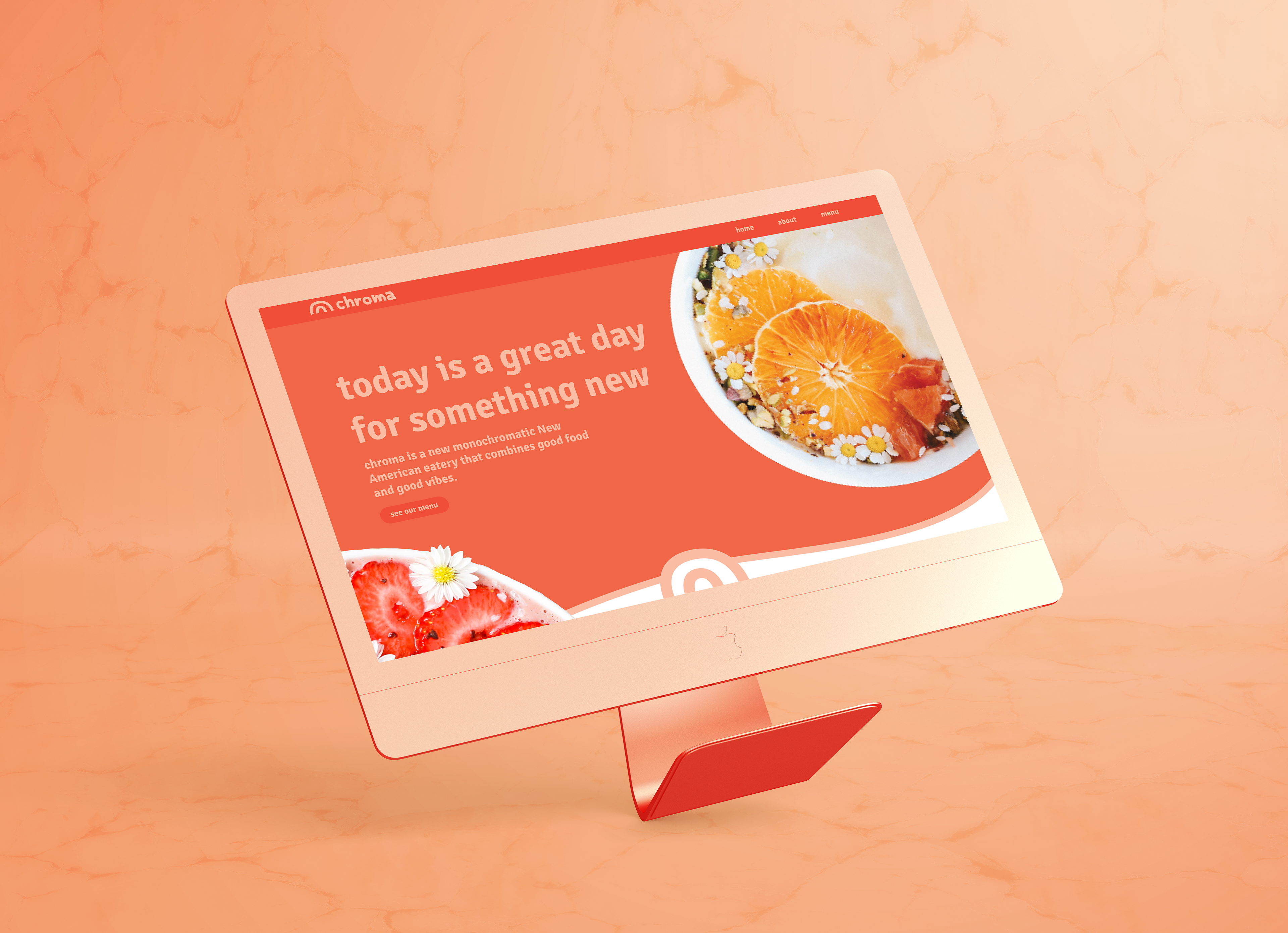
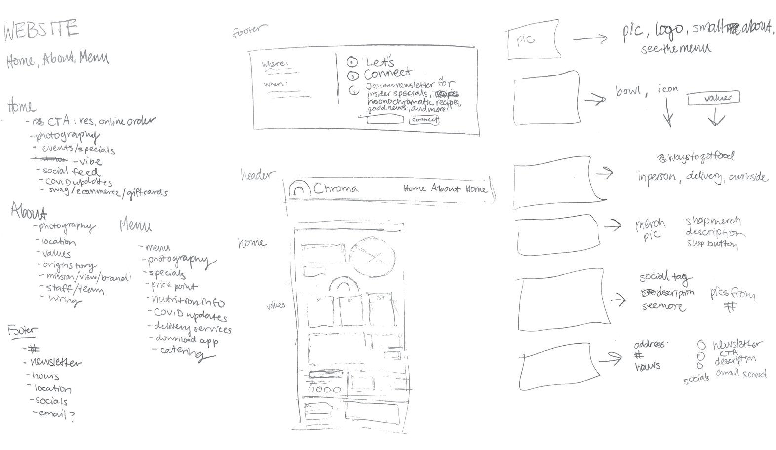
Website
I created a small website prototype with three pages: Home, About, and Menu.
Website: Planning Content
After brainstorming what all needs to be included on each page, I started to divide it up into pages sections and sketch out how that might look.
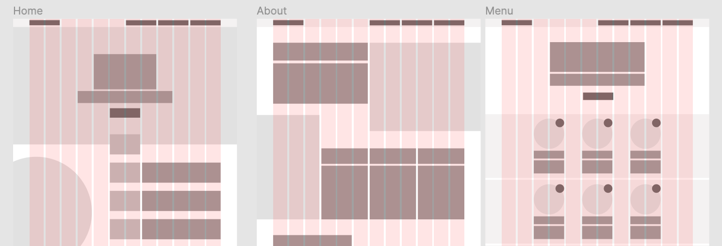
Website: Low Fidelity
Using Figma, I laid out the wireframes for the three pages using a grid system.
Website: High Fidelity
Using Figma, I laid out the wireframes for the three pages using a grid system.
Collateral
Examples of how the brand elements could be used on coasters, t-shirts, stickers, and a hat.